I designed every ad on Expedia
Expedia Group, Ads
$483M to $758M
Expedia Group ad revenue a year, 2023 to 2025, from the Form 10-K. The ad units travelers see across that business are the ones I designed.
When I joined Expedia Group in 2020, nobody there designed ads full time, and every advertiser wanted something different on the page. I became the first dedicated ads designer, and most of the time the only one, working across five PMs. I designed all 29 consumer ad units on Expedia, Hotels.com and Vrbo, wrote the rules they follow, and shipped them with PMs and engineers. One of those units brings in $13M+ a year on its own. Since 2020 the ads business my units power has earned $2.9B+.
- My role
- Solo designer on ads, and the first one Expedia Group had
- What I owned
- Every consumer ad unit, the rules behind them and the Figma ads system
- Worked with
- PMs and engineers, plus ad sales and creative
- When
- Nov 2020 to now. Lent to Lodging and Checkout in 2022 and 2023, then brought back to ads because the work needed me
The short version
- Problem
- Travelers skip anything that looks like a banner, and a page that hides what’s paid loses their trust. Meanwhile every advertiser wanted something different on the page.
- Constraints
- Expedia Group’s first dedicated ads designer, usually the only one, across five PMs. Expedia, Hotels.com and Vrbo, web and app, held to WCAG 2.2 AA.
- Key decision
- One card anatomy that reads like Expedia’s own content, with an Ad label that never moves, written down as rules anyone could follow without waiting on me.
- What I ruled out
- Free-form layouts for every advertiser. They looked bold in review, but on the real page they broke the layout and blurred where content ended and ads began.
- Outcome
- 29 consumer ad units shipped. One makes $13M+ a year. Ad revenue grew from $483M a year in 2023 to $758M a year in 2025, and the business has earned $2.9B+ since 2020.
You’re doing this as a sole XD designer working with 5 PMs.
Travelers scroll right past anything that looks like a banner
Before I drew anything, I listed every spot on Expedia where an ad could show up and every kind of advertiser buying one: hotels, airlines, airports, destinations, car companies, cruise lines and vacation rentals. Ad sales and the creative team told me what advertisers kept asking for. Then I looked hard at how travelers move through the pages those ads sit on.
Two things kept coming up. Travelers skip anything that looks like a banner. And once a page hides what’s paid, they stop trusting it. That set the bar for everything after: an ad on Expedia has to look and behave like Expedia, and say plainly that it’s an ad.
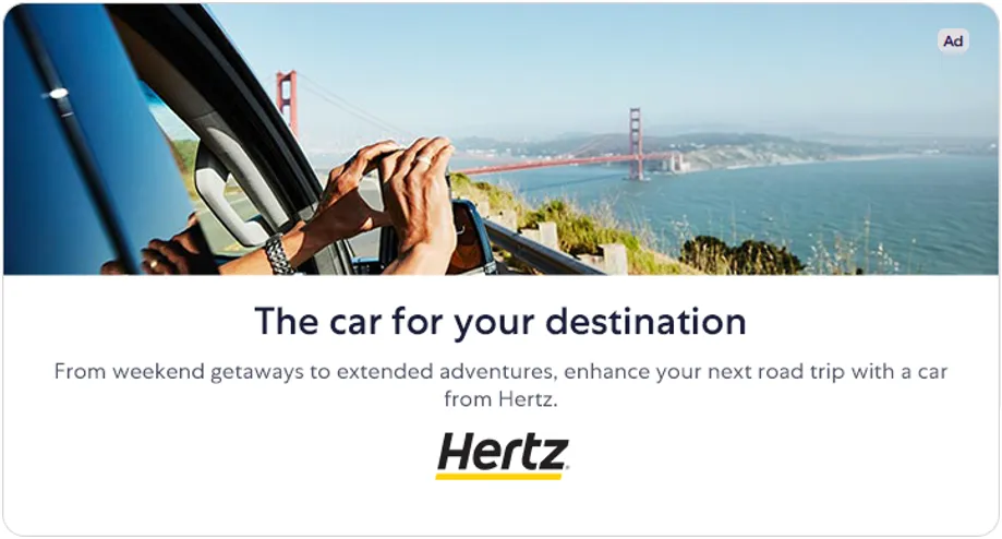
Design notes
- Place before offerIt opens on a photo, not a banner, so it feels like Expedia.
- Fixed Ad labelSame label, same corner, on every unit.
- 40 character headlineOne idea lands in a glance and never wraps badly on a phone.
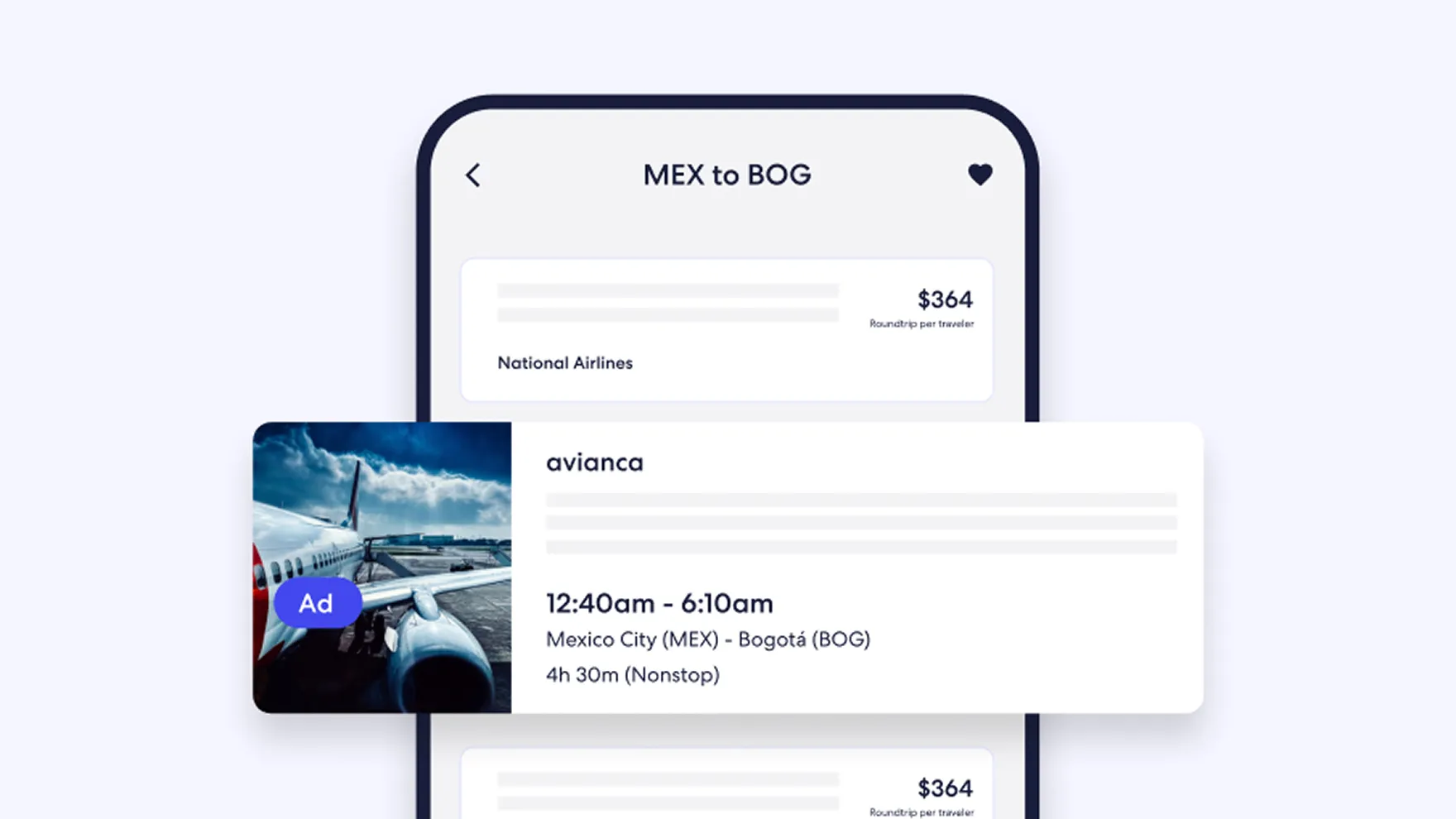
Design notes
- Built like a resultThe airline gets the top spot without breaking the results list.
- Label on the photoTravelers always know which flight is paid.
- Real flight detailsTime, route and length match every result, so it stays comparable.
My first ad became the template for all of them
I didn’t want 29 one-off designs. The plan was one product family with one anatomy, one set of rules and one Figma system, so every new unit started from something that already worked and shipped faster.
I started with the Native Marquee Card, the big brand unit right under the search box. It was my first ads design at Expedia, and every unit after it is built on it.
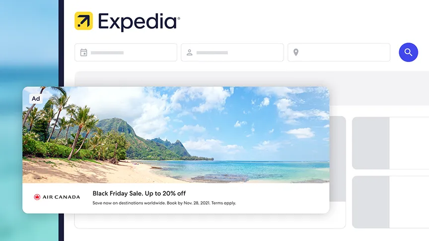
Design notes
- Inside the pageIt sits under search like Expedia content, not like a banner.
- Fixed Ad labelIt owns one corner, no matter how bold the creative gets.
- One headline, one line40 characters of headline and 100 of copy keep one idea per unit.
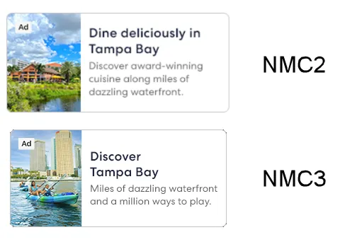
Design notes
- Same anatomy, smallerNew sizes start from a proven base and ship with no new rules.
- Same order of layersTravelers learn the pattern once and read every card as Expedia.
- The label never movesSame corner at every size.
The bold layouts looked great in review. I cut them anyway.
In Figma I took the Marquee in a lot of directions, from loud brand layouts to cards that sit in the page like Expedia’s own content. The tempting option was letting every advertiser bring a free-form layout. It looked bold in a review. On the real page it broke the layout and blurred where content ended and ads began, so I cut it.
What survived is a card that matches Expedia’s content: one image, a short headline, one link and an Ad label that never moves. Every unit further down this page uses that anatomy.
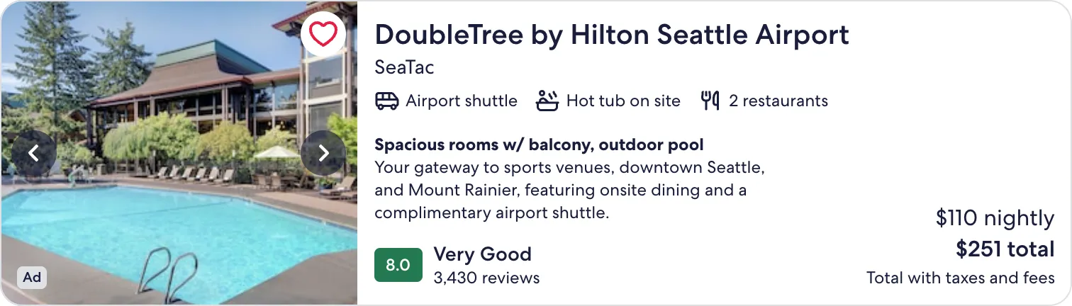
Design notes
- Same card as resultsReads like every other result. Only the label says it’s paid.
- Label on the photoOne label tells travelers which result is paid.
- One advertiser lineHard copy limits keep the advertiser to one idea.
- Real price, usual placeA sponsored stay is still a fair comparison.
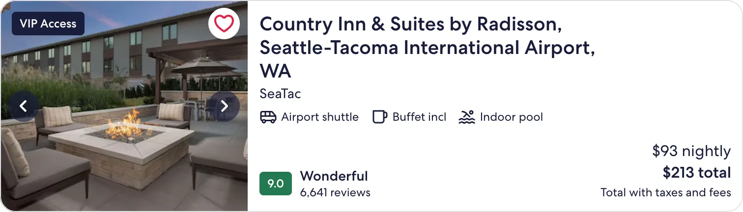
Design notes
- Same photo slotThe same photo slot the Sponsored Listing uses.
- Same details, same orderName, area and amenities read the same on every result.
- Price in one placePrice sits in the same spot on paid and organic results.
The rest of the family
All live, from Expedia Group Advertising’s public materials. Hover a unit to see what each part is doing.
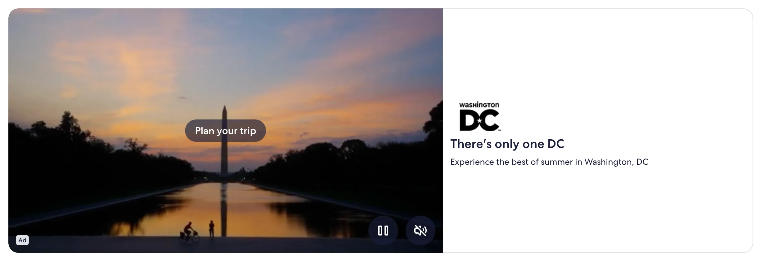
Design notes
ResultLive on the Expedia homepage, giving brands video in a native slot.
- Motion tells the storyOn the homepage, a moving story inspires a trip. A banner would just interrupt.
- One clear actionOne button. Travelers always know where the ad goes.
- Ad label always onAlways marked as sponsored. That’s what keeps the page trustworthy.
- Logo stays smallThe brand stays present without competing with the video.
- Short headlineIt reads in one glance, even on a phone.
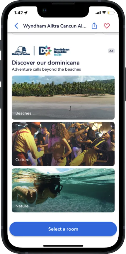
Design notes
ResultLive on web and app. Partners tell three stories in one unit.
- Logos firstTravelers see who is speaking before they read a word.
- One idea on topOne headline ties three stories into a single message.
- Three stories, one unitTravelers explore a place from three angles before they book.
- Same label, same spotSponsored never feels hidden, on web or in the app.
- Booking one tap awayInspiration still leads straight to rooms.
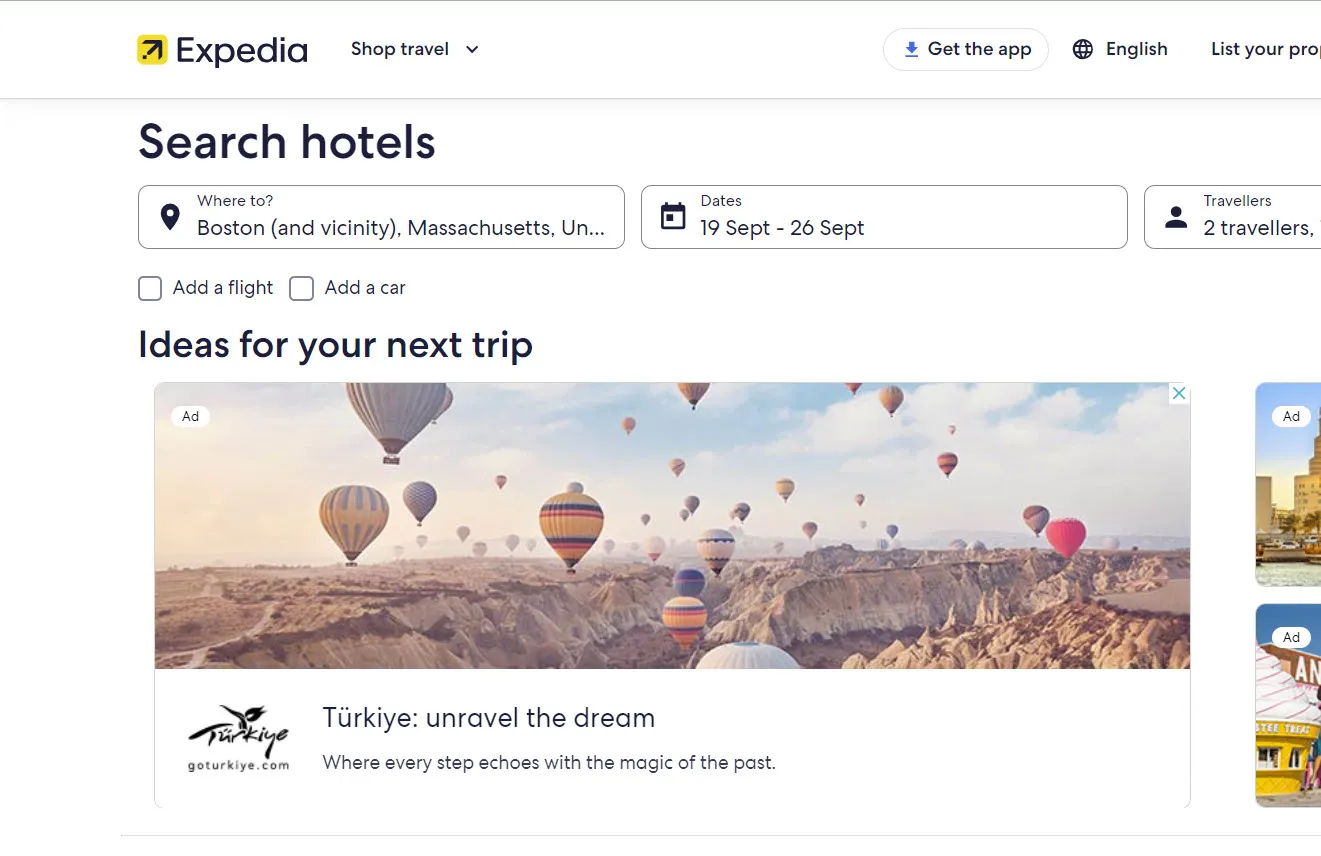
Design notes
ResultMy first ads design, and the base for every unit after it.
- The photo sells firstOne large image sells the place before any copy does.
- Fixed corner labelSame corner every time, whatever the advertiser’s photo looks like.
- Credit, not clutterThe logo credits the brand without fighting the photo.
- Short and specificOne idea that reads in a single glance.
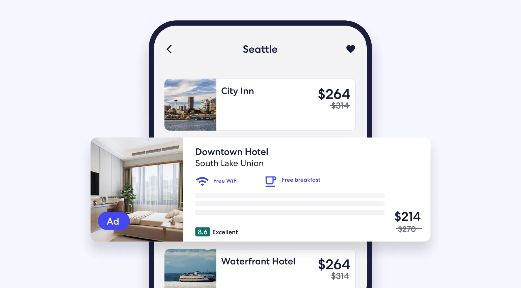
Design notes
ResultMy redesign of Sponsored Listings is what travelers see today.
- Looks like a resultBuilt from the organic card. Travelers compare it like any other hotel.
- Label on the photoSponsored is clear at first glance, without a separate banner.
- A real propertyA real hotel name makes the ad a real choice.
- Price where it belongsThe real price in the usual spot keeps comparison fair.
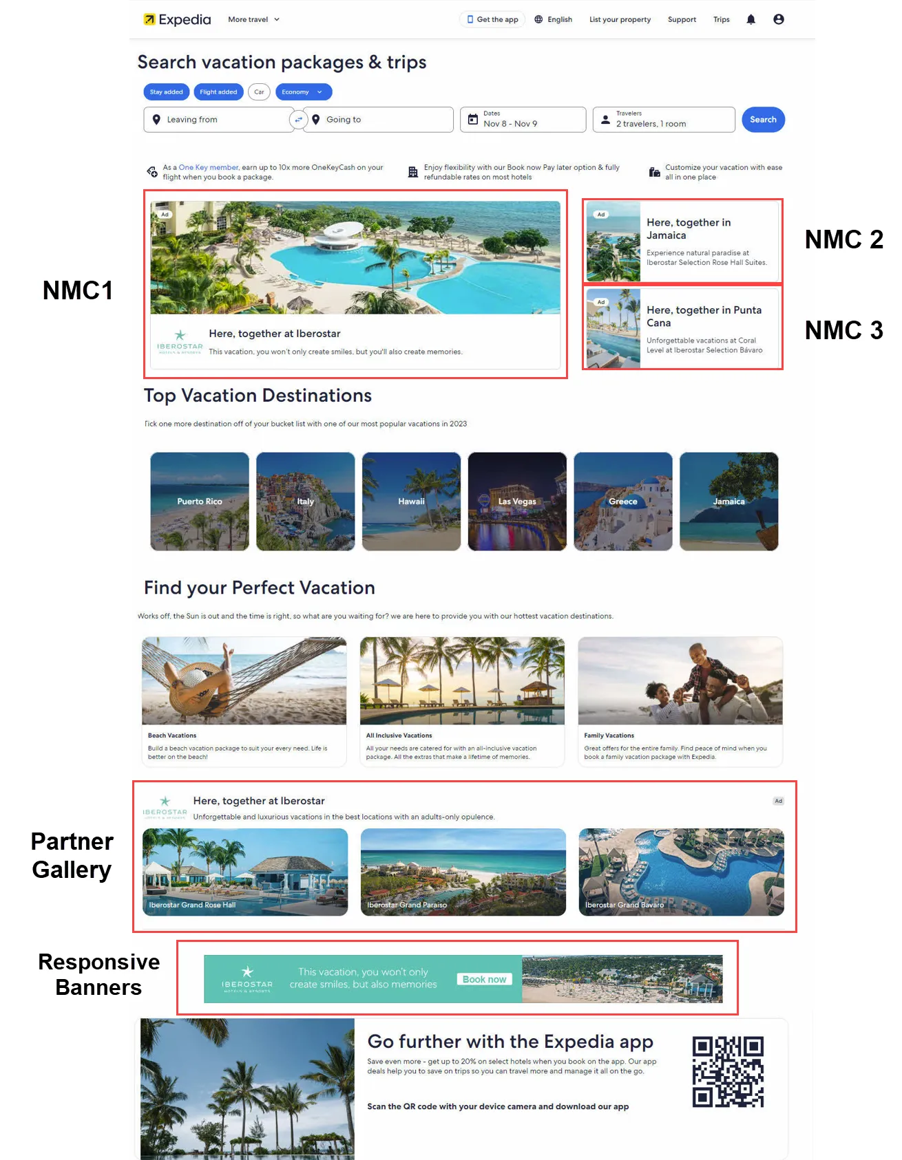
Design notes
ResultOne advertiser owns the homepage for 24 hours, as one story.
- Biggest card leadsOne brand owns the first look at the homepage.
- Smaller cards repeatThey carry the same story without crowding search.
- Reward for scrollingA gallery lower down pays off for travelers who keep going.
- One campaign voiceEvery banner speaks for the same campaign. The day reads as one story.
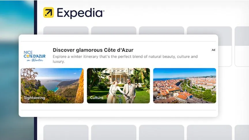
Design notes
ResultDestinations show many sides of a place in one unit.
- Partner creditThe destination logo builds recognition without taking over.
- Name the placeTravelers know where they are going before they browse.
- Start with interestsThemes let travelers begin with what they care about.
- Consistent labelThe same label as every unit, so trust carries across.
Design notes
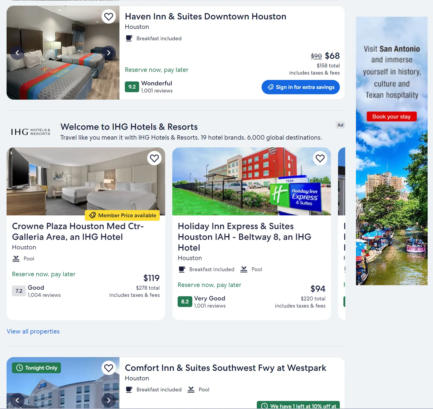
ResultHotel brands show their own properties inside real search results.
- One line headerIt introduces the brand without pushing results down the page.
- Bookable hotelsReal properties travelers can book straight from the row.
- One label per rowA single label keeps the whole row clearly sponsored.
Rules I wouldn’t bend
Advertisers ask for exceptions. These four rules don’t get any. Here’s what each one costs.
One anatomy for every advertiser
A hotel, an airline, a tourism board and a cruise line all get the same layers in the same order. Advertisers give up some layout freedom. In return travelers learn the pattern once, and every new unit starts from a base that already works.
The Ad label never moves
Same place, same style, in every unit on every brand. The ads business only works while travelers trust the page, and a label that wanders or hides spends that trust. It costs a little visual freedom in every placement. I’ll take that trade every time.
Every video speaks and captions
The video units I designed carry a voiceover and closed captions, on top of a Figma ads system built on Expedia’s accessibility guidelines. Plenty of travelers watch with the sound off, and some can’t see the screen well. Captions cover the first group and the voiceover covers the second. Yes, it’s one more thing an advertiser has to deliver before a video can run.
40 characters, 100 characters, one link
That’s the headline, the description and the link count for every card. One idea reads in a glance, never wraps badly on a phone, and an agency gets it right the first time. Some campaigns have more to say. That’s what the landing page is for.
I tested the system before anyone else relied on it
There was no shared ads library in Figma, so I built the first one, on Expedia’s design and accessibility guidelines, and tested its documentation and its accessibility before other teams started depending on it. Later I reorganized the whole ad product file library from top to bottom, and the feedback from our creative vendors was overwhelmingly positive.
Accessibility is where I don’t cut corners. I hold Video Ads, Travel Ads and Display Ads to WCAG 2.2 AA. When engineers built the new ad creative templates, I worked with them so the templates used design tokens correctly, followed EGDS (Expedia’s design system) and met those requirements. Every unit was measured on click-through and conversion across lines of business, and what we learned went into the next round.
Evan has also been a champion of accessibility and standardization within the EG Ads remit.
Video started as a hunch, and I got it on the roadmap
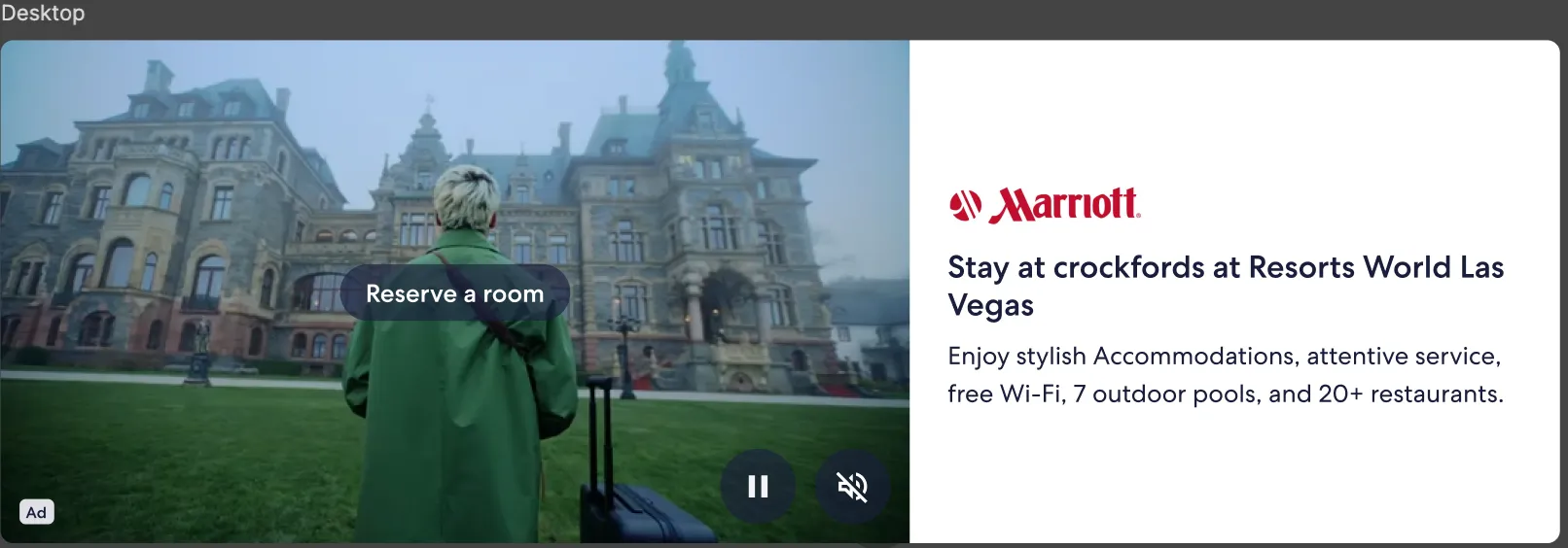
I spotted the potential for video ads in what Expedia’s Story team was doing, and pushed until video ads were on our team’s roadmap. I had three weeks for the proof of concept in search results. I had it done in about two.
From there I led the design of video ads for search results and the homepage on a one month deadline, and presented them to leadership, stakeholders and the consumer teams. Video now runs across the homepage, search results, Stories, TravelShop and the video player, and every unit carries a voiceover and closed captions.
Video. Evan has been our thought leader in this space and has delivered.
Design notes
- Video inside resultsMotion in a listing travelers already read. Expedia reported 2x click-through.
- Voiceover and captionsCaptions work with the sound off. Voiceover works without the picture.
- Details beside the videoIt reads as a hotel result, not a banner.
- Fixed Ad labelSame corner for every brand, video included.
I wrote the rules down so nobody had to wait on me
Being the only ads designer meant I was in the room with PMs and engineers from the first concept to launch. It also meant I could easily turn into the bottleneck. So I wrote the rules down, clearly enough that someone in ad sales, an advertiser’s agency and an engineer all make the same call without waiting on me. They live on the public creative spec site advertisers use today.4
I also designed flows in the advertiser dashboard, so what an advertiser sets up is what a traveler ends up seeing. And back when the ads business was still called Media Solutions (MeSo), I wrote the technical documentation for every ad product, so design and engineering teams across Expedia Group could plan with it.
He has grown to become a Figma, EGDS and Shared UI subject matter expert and in this quarter he has used this understanding to deliver critical technical documentation of all MeSo products for use by the wider XD and Engineering teams.


Türkiye: unravel the dream
Where every step echoes with the magic of the past.
Fits. Reads in one glance.
Then I fixed the pages ads lead to
Click a display ad and you land on an advertiser page on Expedia. Those pages ran on an old system, the copy limits were loose, and some pages had ads inside the ad. Expedia creates 23,000 of them a year, so any problem in the template showed up thousands of times.
In 2026 I led the end to end design of the Display Ads landing page redesign across web, mobile web and iOS, and the move off the old system. The new standard has cleaner layouts, tighter character limits, clearer sponsorship labels and no more ads in ads. By my own measure that’s a 53% gain in operational efficiency across the 23,000 landing pages we create every year. I designed it in Figma, then handed it off to engineering with Claude and shared UI components, which cut real time out of the handoff.
One unit makes $13M+ a year on its own
That’s incremental revenue, from one unit I designed. Across the family, my units raised click-through and conversion across lines of business.
For the company as a whole, Expedia Group’s ad revenue grew from $483M a year in 2023 to $758M a year in 2025, up 57%.1 Added up from Nov 2020 through the first half of 2026, that business has earned $2.9B+, and every traveler-facing ad unit in it is one I designed. Expedia reported that its video ads doubled click-through rates and that sponsored listings partners grew 22% to their highest level.2 It ended 2025 with a record number of active partners and video ads on the Expedia homepage.3
On the product side, Marquee Ads are now the top-selling product across Travel Ads, and the Featured Brand Carousel is one of the top three.
What shipped: every consumer ad unit in the public catalog (29 units in 8 families on Expedia, Hotels.com and Vrbo), including the Marquee on web and the Vrbo Marquee in the app, the Partner Gallery in app property pages and web search results, the Featured Brand Carousel, interstitials for flights and cars, and the TravelAds carousel on Trips. Plus video ads, ROKT, the Sponsored Listings redesign, flows in the advertiser dashboard, and a Figma ads design system designers across Expedia reuse.
All 29 units I designed
Native Marquee Card
- Native Marquee Card 1
- Native Marquee Cards 2 & 3
- Native Marquee Card, mobile app
- Hotels.com Native Marquee
- Native Marquee Carousel
Homepage takeovers
- Expedia homepage takeover
- Tabbed homepage takeover
- Hotels.com homepage takeover
Brand Results Listings
- Hotel Brand Results Listing
- Destination Brand Results Listing
- Airport Brand Results Listing
- Flights Brand Results Listing
- Cars Brand Results Listing
- Cruise Brand Results Listing
- Vrbo Results Listing
- App Brand Results Listings
Video
- Video Brand Results Listing
- Homepage Video Ad
Galleries and carousels
- Partner Gallery
- Destination Experience Gallery
- Featured Brand Carousel
In-flow units
- Flights Upsell Listing
- Interstitials
- Audience-First Native Bundle
Sponsored listings
- TravelAds hotel sponsored listing
- Flights sponsored listing
Display and landing pages
- Standard display
- Rich media display
- Advertiser landing pages
If I did it again, I’d measure trust next to click-through from the very first unit. We only added it once the family was already live, because clicks are easy to count and they got counted first. The next thing I want is the copy and image rules built into the creative tools, checked as advertisers type, so a campaign launches right the first time with no review rounds.
Sources
Quotes are from my Expedia Group reviews and peer feedback, word for word. Ad images are Expedia Group Advertising’s public marketing materials, shown for context. The two hotel result cards are live expedia.com, captured October 11, 2026. Advertiser creative belongs to its owners. Company figures are Expedia Group’s own reporting. $13M+, the 53% landing page gain and the product sales ranking are my own measured results.
- 1Expedia Group FY2025 Form 10-K, revenue by business (advertising excl. trivago)
- 2Expedia Group Q1 2025 earnings call transcript, May 8, 2025 (video ads, 2x click-through; sponsored listings partners up 22%)
- 3Expedia Group Q4 2025 earnings call transcript, Feb 12, 2026 (record active ad partners; video ads on the Expedia homepage)
- 4Expedia Group Advertising public creative specifications site