I designed how travelers pick a hotel and pay
Expedia Group, Lodging, Checkout, Landing Pages
$7.8M + $5M
$7.8M from the lodging app redesign. $5M from checkout optimization.
Picking a hotel and paying for it is where Expedia makes its money, and three different teams owned the steps. I designed the lodging card, the property page and the checkout flow with its travel insurance add-on, usually as the only designer on the team. I also co-built Source Views, the Figma library 500+ designers now start from, and I was a major contributor to the homepage redesign.
- My role
- Designer, usually the only one on each team
- What I owned
- Lodging card and property page, the lodging app redesign, checkout flow and insurance add-on, Source Views and the checkout design system
- Worked with
- PMs and engineers on Lodging, Checkout and Landing Pages
- Platforms
- iOS, Android, mobile web and desktop
The short version
- Problem
- Picking a hotel and paying is one decision for a traveler, but the card, the property page and checkout belonged to three different teams.
- Constraints
- Usually the only designer on each team. iOS, Android, mobile web and desktop. The business needed checkout gains every quarter.
- Key decision
- Make it feel like one product: one source of truth for lodging, and a checkout that got better in place, with new pages live next to the legacy ones.
- What I ruled out
- A full checkout rewrite, which would have paused the quarterly gains. In the apps, concepts engineers couldn’t ship stayed in Figma.
- Outcome
- $7.8M from the lodging app redesign, about +2.2% conversion. $5M from checkout optimization. 500+ designers start from Source Views.
One trip, three teams
A traveler compares hotels on a card, decides on the property page, then pays in checkout. Each of those steps belonged to a different team. I walked the whole path on every platform and looked for the spots where travelers hesitated.
For the traveler it’s one decision, so it had to feel like one product, with the same patterns from the first card to the last tap. That gave me two jobs. Lodging needed one source of truth, so every lodging designer started from the real product. And checkout had to get better in place, step by step, so the business saw gains every quarter.
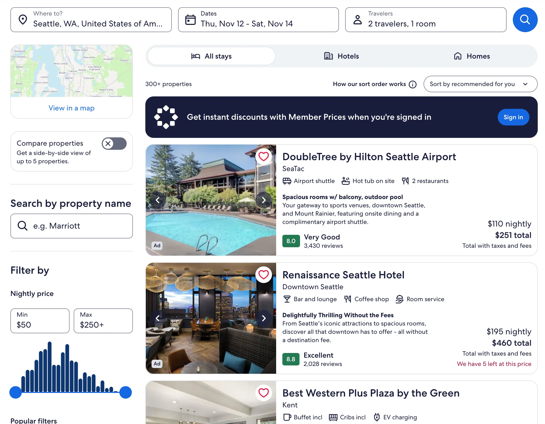
Design notes
- Sponsored Listings leadThe first results are Sponsored Listings I redesigned, on the same card.
- One card for allEvery result reads the same way, top to bottom.
- Total on every cardTaxes and fees included, so travelers compare price in one pass.
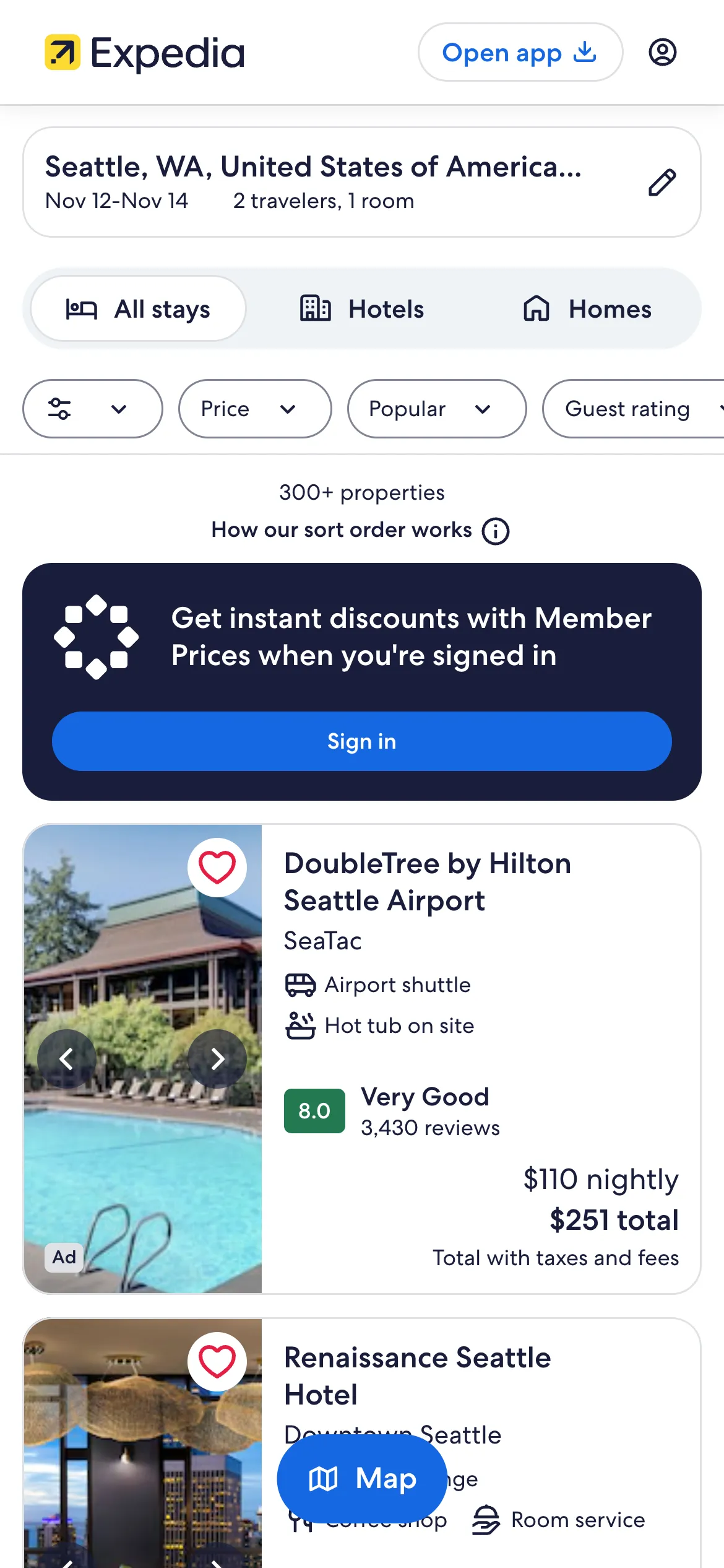
Design notes
- Same card, one columnThe desktop order holds: name, amenities, rating, then total.
- Total stays visibleTravelers compare totals without opening a hotel.
Seattle hotel results on expedia.com, desktop and mobile web, captured October 11, 2026.
The card travelers scan, and the page they land on
I designed the lodging card travelers scan in search results, and the property page they land on when they tap one. On the dateless property page, the version travelers see before they’ve picked dates, a test I worked on won with a +1.75% conversion lift.
With a fellow designer I built Source Views, a Figma library that mirrors what’s live in production. Open a new lodging file and you start from the screens travelers see today, not from zero. 500+ designers start there now. Once it worked for lodging, I used what we learned to bring the ads Source Views up to the same standard. The catch with a library like that: it’s only useful while it matches production, so it has to keep pace with every release.
You communicate these decisions and your rationale clearly, which allows others to provide feedback to help you refine your chosen approach.
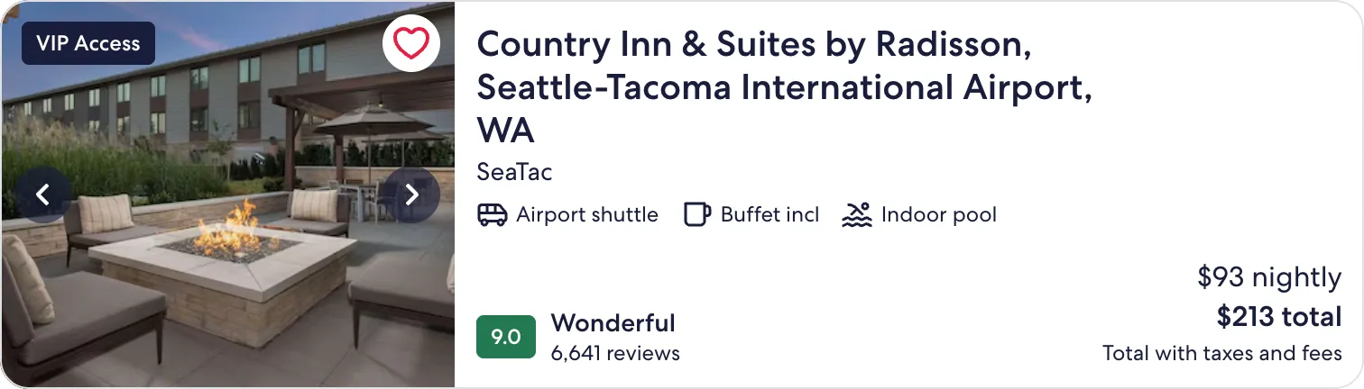
Design notes
- Name and area firstWhere the hotel is reads before anything else.
- Three amenities onlyOnly the ones that help a choice. The card stays easy to scan.
- Rating with reviewsA score beside its review count is easy to trust at a glance.
- Total, taxes includedThe price on the card is the price travelers plan around.
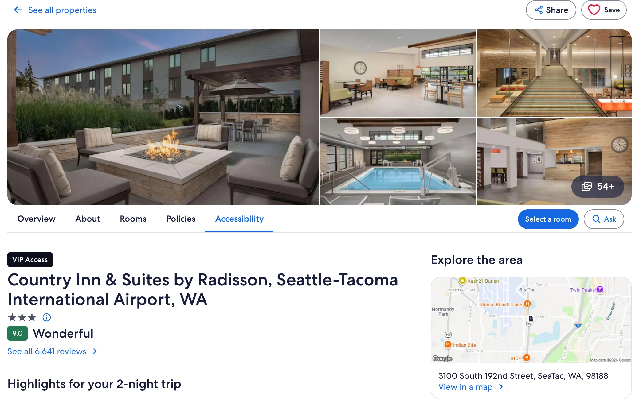
Design notes
- Photos leadThe place speaks first, with the full gallery one tap away.
- Tabs for every questionRooms, policies and accessibility are one tap from the top.
- Next step in viewSelect a room stays visible and leads straight to room choice.
- Continuity from the cardSame name and rating as the card travelers just tapped.
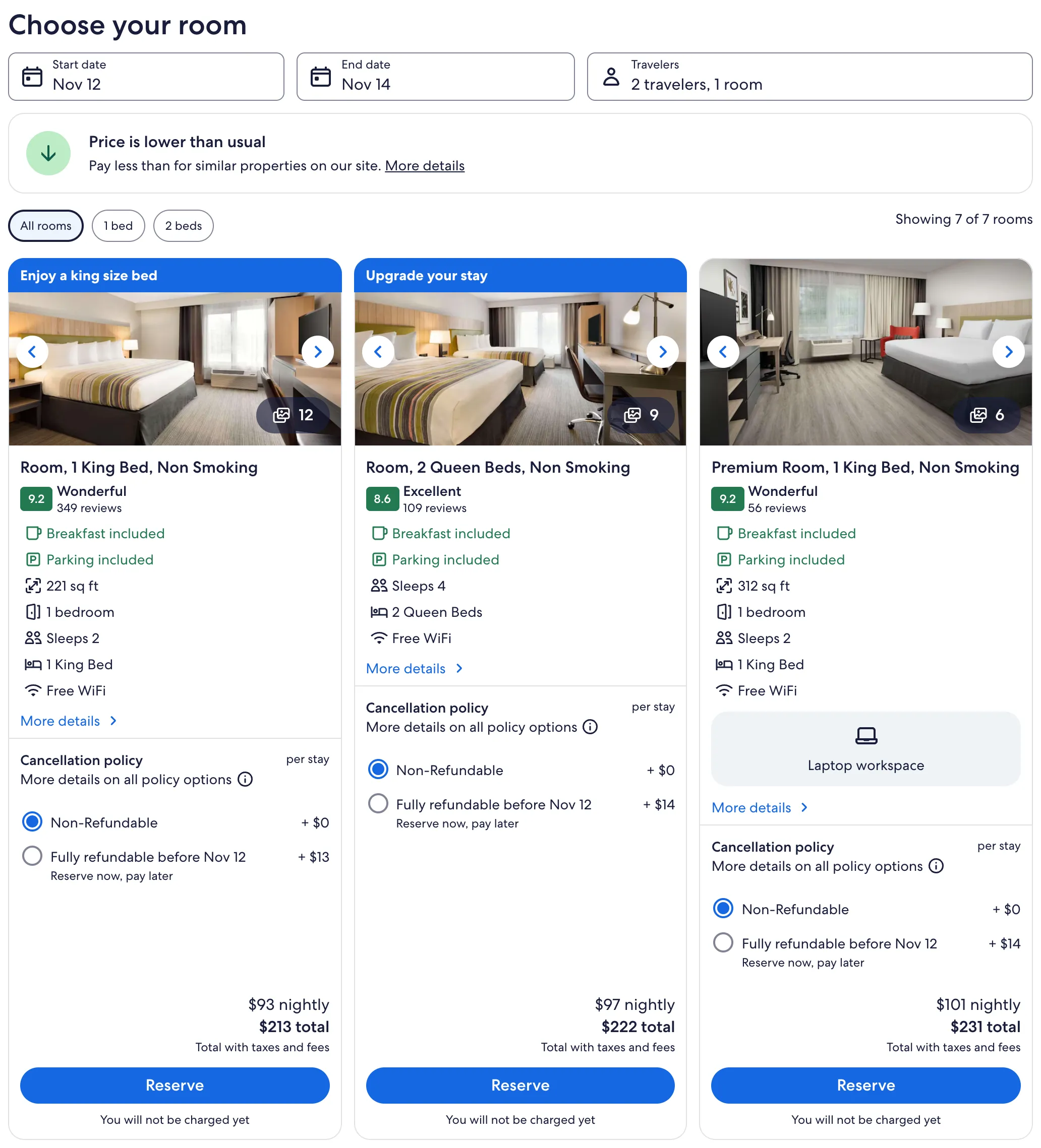
Design notes
- Rooms side by sideThree rooms in one row, compared before anyone reserves.
- Beds and size alignedEvery room shows what differs in the same place.
- Cancellation as a choiceFlexibility shows its price right beside it.
- Total, then ReserveThe trip total sits on every room, and Reserve says no charge yet.
For the app’s splash screen, I taught myself animation in Figma
For the lodging native apps I explored and prototyped 5+ concepts: micro-interactions, a splash animation, video, a 360° view and motion graphics. My one rule was that engineers had to be able to ship it, which meant some of the wildest ideas never made it past Figma.
The splash screen needed animation I didn’t know yet, so I taught myself animation in Figma, set up a crawl, walk and run plan with the teams involved, and got the green light from the Brand team. I took a leading role on the native photo gallery and pushed to keep it consistent with the web gallery. When research needed a complex imagery prototype on a very tight deadline, I built it in a week. I also moved guest review scores in the iOS and Android apps from out of 5 to out of 10. That one won its test.
The redesigned lodging apps raised conversion about 2.2%, worth $7.8M, and improved engagement and accessibility.
Checkout got better while it kept running
The business needed checkout gains every quarter, and a full rewrite would have paused them. So new checkout pages went live next to the legacy ones, and for a while two generations of pages had to look and behave like one. I contributed to that hybrid with 2 designers, a UX writer, a researcher, 2 PMs and 5+ engineers, and I finished the checkout design system that held it together. I also designed the checkout flow itself, including the travel insurance add-on.
In one quarter I finished four to five checkout projects. One of them, a points payment popover for lodging, won its test. Checkout optimization brought in $5M in revenue and beat the quarterly BPS targets two quarters in a row.
The add-on is a plain choice at the moment you pay: protect the trip, or skip it. The screenshot shows how it looks in Expedia checkout today.
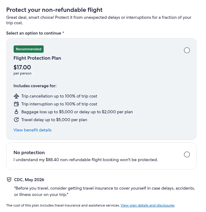
Design notes
Part of the checkout flow I designed.
- A clear add-onCoverage is listed in plain lines before anyone pays.
- Price up frontThe cost per person sits right under the plan name.
- Saying no is fineNo protection is a real, plainly stated option. Nobody gets pushed.
The homepage, one round at a time
I was a major contributor to the Expedia homepage redesign, and it shipped. With PMs and engineers I also re-architected landing pages across every line of business, one round at a time, aiming at engagement, click-through and conversion. Expedia has since moved on to a newer homepage, so the capture below comes from the Wayback Machine.
Looking back, I’d push for one booking scorecard shared by all three teams from day one. Each team measured its own step, so nobody could see whether a gain on the card cost something in checkout. To travelers the path already felt like one product. The numbers should have too.
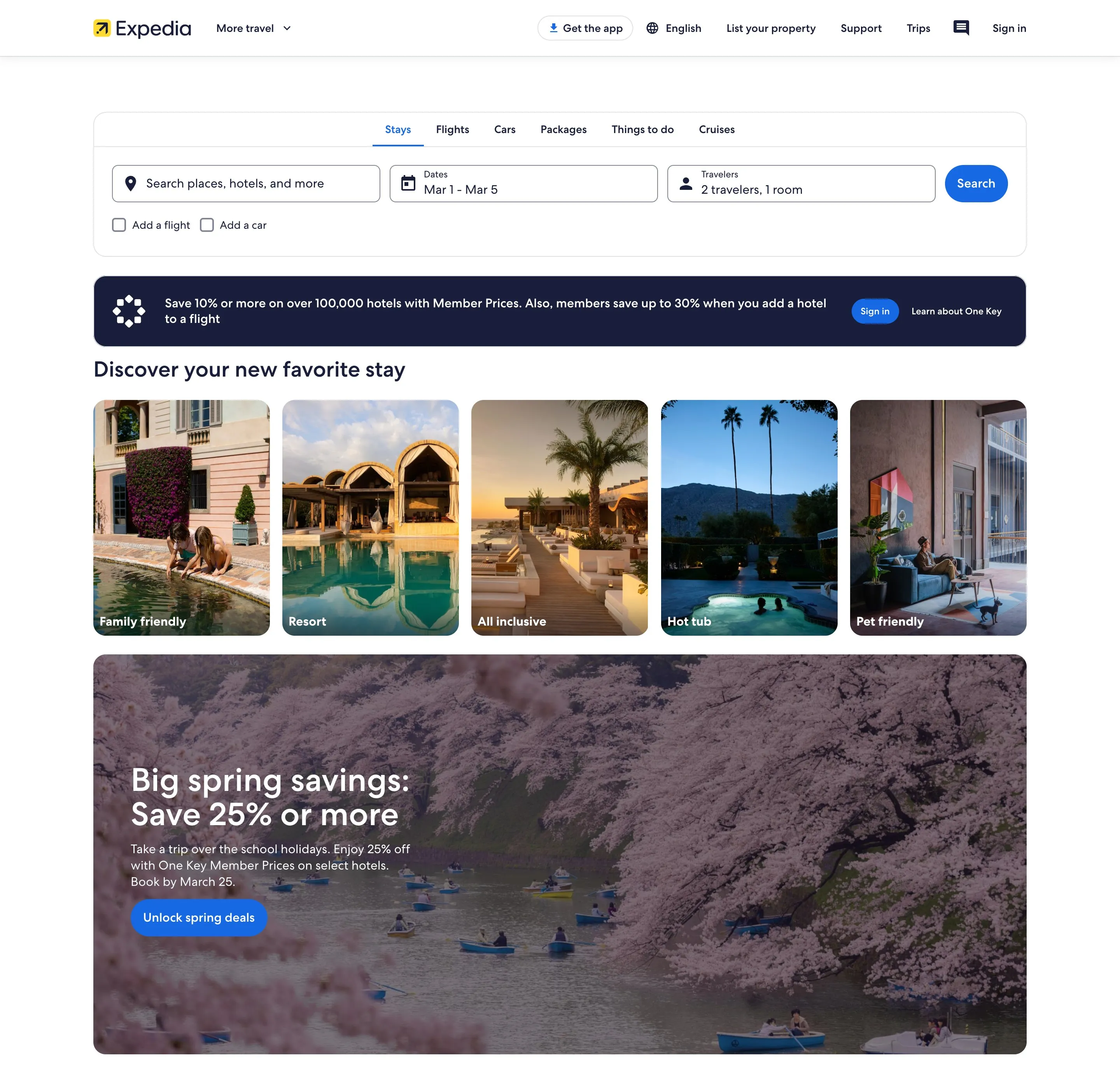
Design notes
I was a major contributor to this redesign, and it shipped.
- One search boxStays, flights, cars, packages, activities and cruises all start here.
- Discover by themeTravelers without a destination still get a way in.
- One offer per bandOne message at a time keeps a long page easy to read.
Sources
Results are my own measured results, as listed on my résumé. Lodging search, card and property page images are live expedia.com, captured October 11, 2026. Hotel photos and names belong to their owners. The trip protection image is the live checkout on expedia.com, captured October 11, 2026. The homepage image is a Wayback Machine capture of expedia.com from March 1, 2024.